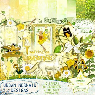
Fairy Dreams in the Summer:

By Dark Phoenix. Great idea to put yourself on the swing element and put photos of your children in the frames, as if you are watching over them.

I love Maike's use of a wave cut-out of one paper that is layered over another. Cool idea to entwine the grass swirl with the tree to look like a beanstalk with the frames at the top!

What a magical stroll through the forest this page looks like by DarkPhoenix!

In the above page by Maike, she has placed her photo behind the grass element which really helps to set the boy into the scene and adds to the realism. The use of the ice-cream element and pixie dust give that Enchanted Summer feel!

I like the way Martina has used the decorative swirl elements as a gateway to the woods and the fairies mirrored are like guardians. The layering of background papers works really well and the ivy tucked under leads the eye right into the page!
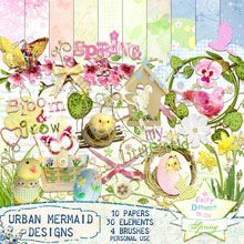
And check out at this beautiful page made with Fairy Dreams in the Spring by Noahriplynute:
I love the way she has hung the little nest swing from the larger nest. What a great idea to duplicate the grass element to create a border at the base of the page!
and Tagger size HERE















No comments:
Post a Comment